Signed in as:
filler@godaddy.com
Signed in as:
filler@godaddy.com

The Shape Map visual has been usable in Power Bi for some time, albeit in 'Preview' state for all of it. It offers a degree of customisability to report makers as, with a little know-how, we can create our own Shape Map files which can then be loaded into Power BI and connected with data.
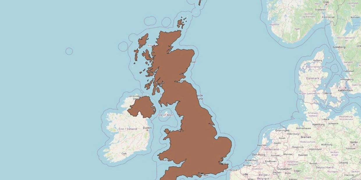
During the pandemic, I got plenty of practice with Shape Maps when creating and updating maps for different restriction zones. Country outlines can be obtained online, but I decided to make my own (a UK outline, top image). Technically though, we can make Shape Maps for just about anything, and with a little engineering we can create some inventive custom visuals using them.
One example of this approach is my Caterpillar Cake Totalizer - a chart showing progress towards a goal when participating in a sales challenge. Using a custom Shape Map of a caterpillar (with each segment representing a chunk of progress towards the goal), a DAX measure can be written to apply colour saturation to each segment to visually show sales progress.

Here I create the Shape Map. Do do this, I use the open source software QGIS. I use a map layer for reference - maybe it's because of my location but I use the UK as a reference. This seems to make the map a workable size and has given me consistent results. I create a caterpillar with ten segments as ten is an easy divisor to track our progress over.

Shape Map files are essentially JSON files containing co-ordinates for each shape. Shapes can also have custom fields specified, and here I create one called Tier and assign values to it (1-10). This is important as these fields are mapped to columns in Power BI when we create our visual.

A bit of trickery here - I overlay a Shape Map visual on top of an imported image. When creating the map in QGIS, I imported an image I created in PowerPoint to use as a template. That same image is reused here. The Shape Map is transparent outside of the actual shapes, so the image below shows through the gaps and fills in the bits that aren't shaded in by my data.
For the purposes of this test, I am creating some dummy sales data (below). I also create a What If parameter for the sales target. This allows us to change this and see the impact on the Shape Map colour saturation.
First, we calculate one-tenth of the sales target, and work out the current Tier (within the context of the visual).
Next, we work out the lower and upper bounds for the current tier, by multiplying by sales target divided by 10.
We also work out the bounds of the tiers before and after the current tier. I did this as it allows me to grade the colour saturation over several tiers instead of just one. This gives a better overall presentation.
Now, we can return our result. If Sales are greater than the upper bound of the next tier, we return 1 (full saturation). If Sales are less than the lower bound of the previous tier, we return 0 (fully desaturated). Otherwise, we return a number between 0 and 1 to show progressive colour shading.

The result is a fun, engaging chart that grabs the attention a lot more than a bar or line chart. Supplemented with other visuals, as above, we can convey both detailed and general insights in an eye-catching way. This won't be appropriate in every, or even many scenarios, but for something like a short-term challenge or focus it can be effective.
If you like, download the PBIX below to see how it works!
Shape Map PBIX (zip)
Download